Introducing language for statistical displays
To develop the language to describe statistical displays, students will need to understand and use terminology relevant for that particular display. Teachers should explicitly teach key terms and features of displays.
Required terminology
For example, when interpreting box plots, students will need to understand and use terminology such as:
- median
- range
- outlier
- quartile
- interquartile range.
Introducing language for statistical displays
Teachers can introduce the language for given statistical displays by:
- Providing two displays that compare the same attribute for two different groups.
- Ask students what the two displays show.
- Point to particular features of the displays and ask students if they know the mathematical terminology. If students do not know the terminology, the teacher introduces the relevant terminology and marks it on the display.
- Discuss how some features of a display can be labelled directly, while other features are found by calculation.
- Students practise using the language that is specific to the type of graph chosen, by comparing and contrasting the features of the two displays.
Example of using language related to box plots
The example below is from a Year 10 class on statistics where students are required to compare the heights of students in Years 7 and 10 using boxplots.
Scenario
Provide two box plots for students showing
- the first and third quartiles (Q1 and Q3)
- the median line (Q2)
- the highest and lowest values (maximum and minimum)
- some outliers
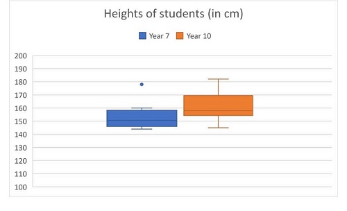 Heights of students represented in box plots
Class discussion
Ask students what the two graphs show. Teacher questions could include:
- "What do we know about the heights of the Year 7 students?"
- "How would you describe the heights of the Year 10 group?"
Identify features
Point to particular features of the displays and discuss what they are showing, asking students to recall their knowledge or explicitly introducing mathematical terminology and definition.
For example, point to one of the median lines, and ask students if they know what the line represents and the mathematical terminology for this.
If students are not familiar with the median on a boxplot, ask students for the meaning of the word 'median'. Summarise the meaning of 'median' for students and annotate the median on the display.
Point to some outliers and ask what they could represent. Discuss the term 'outlier'.
Similarly, annotate the quartiles and discuss the meaning of the first, second (i.e. median), third and fourth quartile.
Discuss correct labelling
Discuss how some features of a display can be labelled directly, while other features are found by calculation:
- the 'range is found by subtracting the lowest value from the highest value
- the 'interquartile range' is found by subtracting the first quartile (Q1) from the third quartile (Q3).
Ask students to write a paragraph to compare the heights of the two groups, using the terminology which has just been discussed.
Curriculum link for the above example:
VCMSP350.
Explicitly teaching terminology for function graphs
Students will need to develop terminology for understanding and using function graphs. This language is related to the axes, as well as the features of function graphs. To choose appropriate labels for axes, students need to consider given information in a problem and identify labels that represent this information.
Students need to understand the difference between an
independent and
dependent variable and identify these in the context of a given problem. The convention is to place the independent variable on the horizontal axis and the dependent variable on the vertical axis. Axes should also be marked with an appropriate scale.
Terms for discussion
To discuss graphs, students should be familiar with terms such as:
- axes
- axial intercept
- origin
- axes intercepts
- gradient
- turning point.
Introducing language for function graphs
Teachers can support students to understand and use terminology for function graphs by:
- providing a set of graphs and asking students to annotate each graph to highlight the independent variable, dependent variable and key features
- asking students to write a paragraph to describe the graph
- having a class discussion about each graph, focussing on the use of terminology.
Teacher questions
Teacher questions could focus on:
- identification of independent and dependent variables
- the shape of the graph,
- whether the graph passes through the origin
- existence of a turning point
- number and location of axes intercepts
- links between the equation of the function and the features of the graph, noting where a function grapher may use function notation (i.e. f(x))
Example of teaching language with function graphs
Scenario
Ask Year 9 students to identify the independent and dependent variables for each graph and then label key features (x-intercept/s (where they exist) and y-intercept).
Following this, get students to write a paragraph to explain each graph, using terminology such as origin, gradient, y-intercept and x-intercept.
Questions and discussions
For each graph, ask students a series of questions where they have to describe features of the graph. For the linear functions students could be asked questions about the intercepts, whether the gradient is positive or negative and whether the graph passes through the origin.
For the quadratic functions students could be asked questions about the number of x-intercepts, the coefficient of
x2, the y-intercept, the turning point, the links between the number of intercepts and the number of solutions for a quadratic equation, etc.
Sample graphs
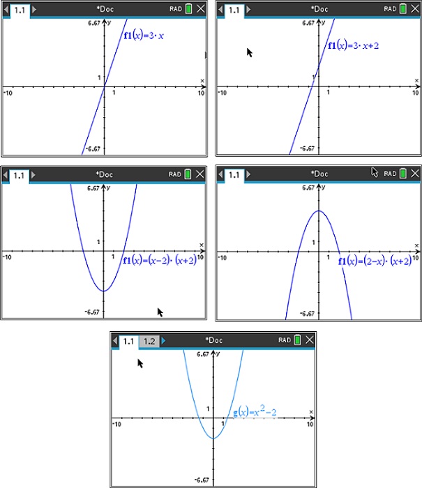 Sample graphs
Curriculum link for the above example:
VCMNA311.