Graphs communicate important quantitative information in a visual format and are often used to communicate health and medical information. Much of the HPE curriculum involves students being presented with information in graphical form. Using this form of representation, students must:
- know how to interpret graphs
- to elicit key information
- extract the basic information
- draw conclusions
- compare and contrast and
- provide recommendations.
Individuals with higher levels of graphical literacy are better able to find information in graphs, and they spend more time looking at conventional features of graphs to generate more accurate interpretations (Okan, Galesic & Garcia-Retamero, 2015).
Teachers should explicitly teach the meaning-making (semiotic) systems of graphical representations before having students analyse graphs (see 'Explicitly teaching text structure' and 'Reading and unpacking visual representations of data' ). This includes explaining:
- the importance of headings
- labelling of axes
- scaling of axes (for example, linear or logarithmic)
- use of colour
- choice of graph type (for example, pie chart, line graph, bar graph, column graph).
Additional strategies to support students to read graphs can be found in
'Language for graphs and statistical displays'.
Using sentence starters to analyse graphs
Sentence starters are one way to scaffold students' interpretation of graphs. Sentence starters provide a focal point for students to begin writing (or saying) an interpretation of the data they are viewing in graphical form.
Sentence starters can range in their cognitive demand, moving from identifying information and patterns in the graph to generating comparisons, predictions, and hypotheses.
Sentence starters teachers can provide students include:
- This graph shows …
- A pattern I notice in the graph is …
- An anomaly/outlier/different pattern in the graph is …
- A difference between … and …. is …
- A similarity between … and … is
- If this pattern continued, I predict …
- A probable reason for that pattern is …
- A probable reason for this difference is …
- When I first looked at this graph …
- The data that most stood out to me was …
The example below provides some completed sentences a Year 7 or 8 student wrote after viewing a graph about the types of drinks consumed by Australian children (VCHPEP129).
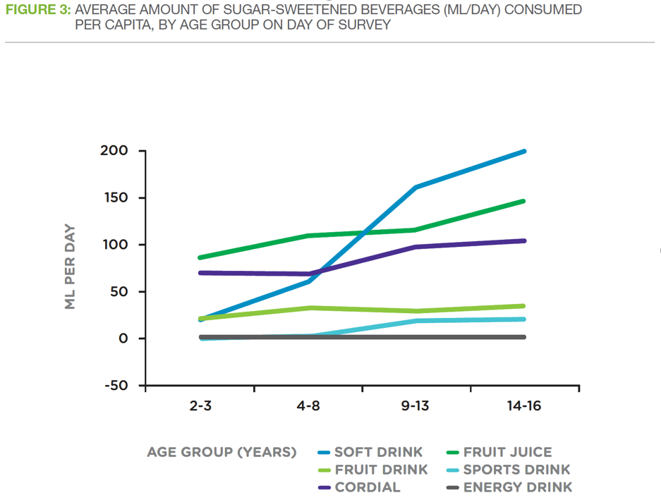
Source: Figure 3 in Boden Institute, University of Sydney 2014. Evidence Brief Obesity: Sugar-Sweetened Beverages, Obesity and Health. Australian National Preventive Health Agency, Canberra.
-
This graph shows the types of drinks drunk by Australian children.
-
A general pattern I notice in the graph is that as the child's age increases, they drink more of these kinds of drinks.
-
A reason for this pattern might be because older children can go out and buy their own drinks.
-
A different pattern in the graph is that energy drinks go down for 14 to 16-year old.
-
A reason for this pattern might be because they prefer drinking other drinks.
-
The data that most stood out to me was that sports drinks were drunk more than soft drinks.
Using a framework to interpret graphs
In HPE, students write with a specific purpose as they communicate their interpretations to others. Students aim to explain, critique, and analyse real-world data relating to health, well-being, and physical activity.
As students become more capable of interpreting data on their own, they can be given frameworks to help structure independent analyses of graphs, whether spoken or written.
One framework to use to analyse a graph is given below. Depending on the length of analysis and information in the graph, the framework could be used to create one paragraph or several.
Below are two samples showing how a Year 9 or 10 student has applied the framework to interpret two different graphs (VCHPEP148).
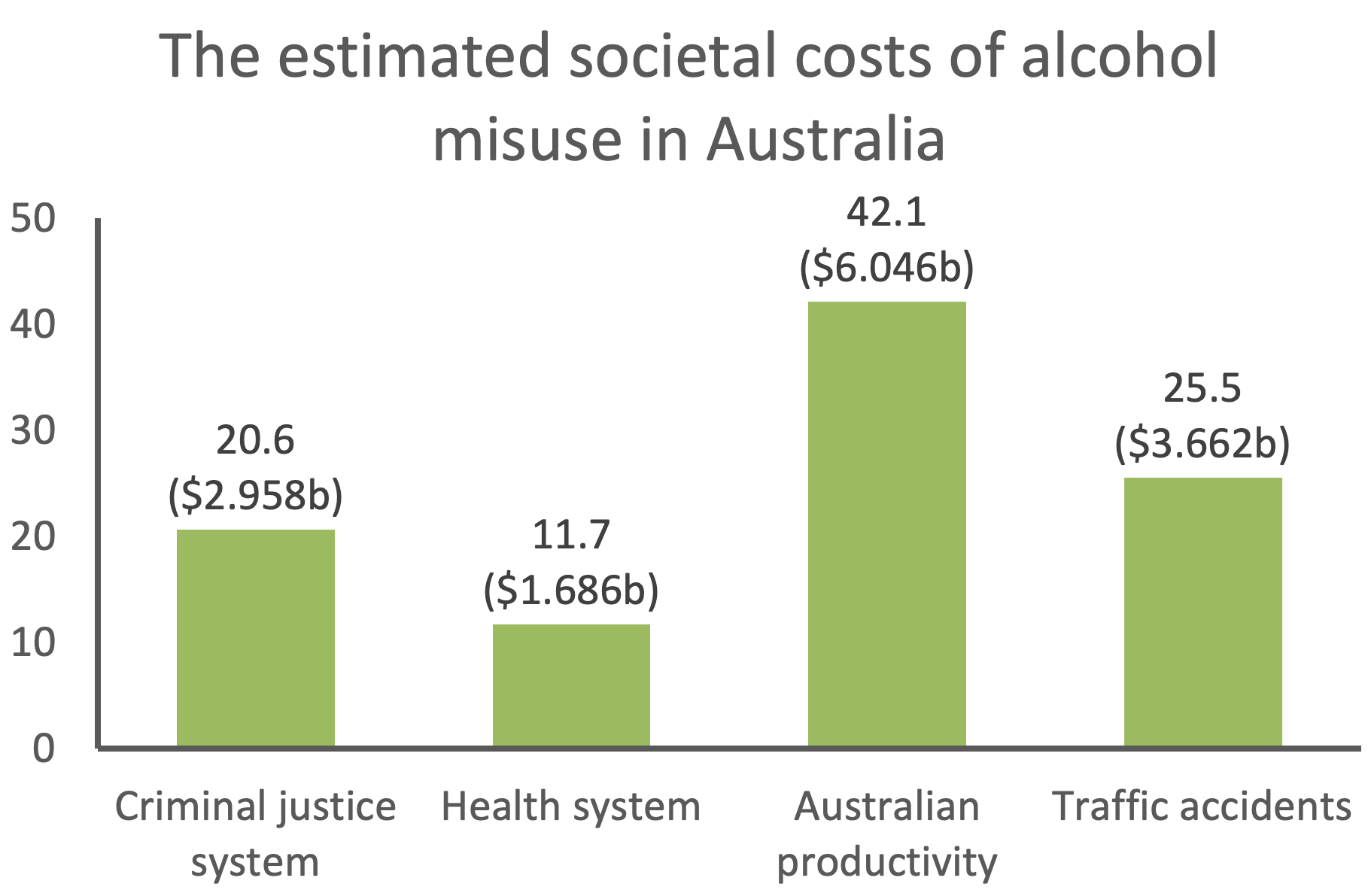
Source:
Manning, M., Smith, C., & Mazerolle, P. (2013). The estimated societal costs of alcohol misuse in Australia.
Trends and Issues in Crime and Criminal Justice no. 454. Canberra: Australian Institute of Criminology
Student sample response
This graph shows the estimated societal costs of alcohol misuse in Australia. The total estimated cost exceeds $14 billion. The largest cost relates to productivity, which accounted for 42.1% or $6.046 billion. Traffic accidents comprised 25.5% or a quarter of the costs ($3.662 billion). Alcohol misuse had the least cost to the health system, costing $1.686 billion.
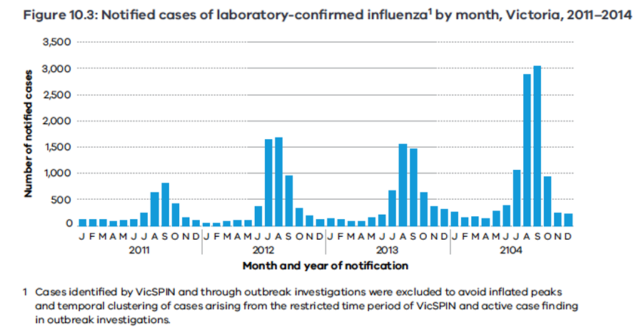
Source: Surveillance of notifiable infectious diseases in Victoria, 2011–2014
Student sample response
This graph shows the number of notified cases of laboratory-confirmed cases of influenza in Victoria from 2011 to 2014. Each year, there is a spike in confirmed cases, which begins in June and lasts until October. This coincides with winter when people are more likely to be spending time indoors. The number of infected cases during the winter spike has also increased each year. In 2011, the peak number of infected cases was around 800 while in 2014, the peak number is just over 3000.