Reading and interpreting maps
Maps are one of the geographer's key tools for representing and explaining spatial information, patterns and processes. Reading and interpreting maps is thus central to geographical education. To effectively read maps, students need to develop a range of interrelated skills:
- locational skills - using grid references, coordinates, longitudes/latitudes
- symbol skills - using the key to interpret the different symbols
- understanding of scale - using a scale to estimate distances and compare areas
- interpretation of data - describing and comparing information shown on thematic maps. (Adapted from Biddulph, Lambert, & Balderstone, 2015)
The two strategies below scaffold students' ability to read and interpret information represented in visual form. Geography teachers can adapt the
Strategies that demonstrate how to explicitly teach the semiotic (meaning-making) systems of visual texts in Science. For a brief explanation of the types of maps encountered in Geography, including their function and a brief description of some of the semiotic systems they use, teachers can view
'Types of maps' produced by the Intergovernmental Committee on Surveying and Mapping.
Explicitly teaching semiotic systems of maps
Maps are a core tool used to communicate in geography. However, they can be complex multimodal texts, each of which may a different semiotic (meaning-making) systems to represent information. Students need to be explicitly taught ways to read and interpret information presented in maps.
Geography teachers would be familiar with explicitly teaching the six features of a map using BOLTSS (this acronym represents the first letters of the six features listed below):
- B – Border: A line around the map to show the edges of the map to prevent confusion with other text
- O – Orientation: Shows direction using a compass rose or North arrow
- L – Legend: Key to the symbols and colours used
- T – Title: A precise name of the map, usually placed above the map or sometimes in the figure caption
- S – Scale: A measure between the map and real-world usually a linear scale, and sometimes a ratio or statement
- S – Source: A source is the origin of the data shown on the map so that the reader knows where the information comes from.
In addition to teaching each of these features, teachers can show students a range of map types and engage them in discussion to explicitly teach the various semiotic systems each map employs (an example of a rainfall map is below). This can be done for each feature of BOLTS, which is demonstrated by teacher questioning in the table below. Responses to these questions will differ depending on the type of map being shown.
|
Border
|
- How do the borders differentiate/separate parts of the map?
- Why are these important?
- What do the borders represent?
|
|
Orientation
|
- Which direction is north?
- Why is the map orientated with north at the top of the page?
- Why is north not orientated at the top of the map?
|
|
Legend
|
- Is there a legend?
- What do the different colours represent?
- What do these different shapes mean?
- Why do you think they've selected those colours/shapes?
|
|
Title
|
- Can you easily see the title of the map?
- Does it explain what the map shows?
- Are there nouns, adjective or verbs in the title?
|
|
Scale
|
- Is there a scale?
- Is there more than one scale?
- What do the numbers represent?
- How is the scale represented: as a line scale, number scale, something else?
|
|
Source
|
- Where did the mapmaker get the information to make the map?
- Is this information from a well-respected organisation?
- Is the information recent? Does this matter?
|
The example below is a Year 7 or 8 student's semiotic analysis of the Australian Rainfall Analysis for the week ending 25 February 2020.
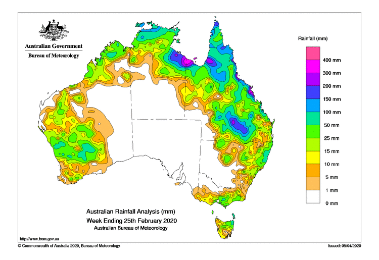
Border
| - There is only one border which contains the map of Australia, the legend, and the title (as well as the BoM logo). There is no surrounding text.
|
Orientation
| - There is no orientation. Most people reading this map would understand that the north is towards the top of the page.
- An orientation should be included.
|
Legend
| - The legend uses colour to show how much rainfall has fallen. Different colours indicate different amounts of rainfall.
- The legend is clearly separate from the map of Australia to avoid confusion. It also has a title with units (mm)
- On the map, the different coloured areas indicate how much rain has fallen in the week.
|
Title
| - The title is at the bottom of the page. It explains that the map shows the amount of rainfall across the week ending 25 Feb 2020.
- It is an extended noun group to describe the graph.
- 'Analysis' is the noun; the map is a detailed examination of something.
- 'Australian' and 'Rainfall' are pre-modifiers. 'Rainfall' is a pre-modifying classifying adjective that modifies 'Analysis' to let the reader know that the analysis map is about rainfall. 'Australian' is also a pre-modifying classifying adjective that indicates the rainfall is for Australia. Classifying adjectives are used to divide people or things into particular groups, types or classes and cannot take intensifiers such as 'very' or 'rather'.
- 'Week Ending 25th February 2020' is the qualifier and adds complementary information. The map shows rainfall in Australia from 19 to 25 February 2020.
|
Scale
| - There is no scale. Information about distance is not central to the meaning generated by the map. The map is informing us about the volume of rainfall.
|
Source
| - This data is collected by the Bureau of Meteorology. It is a respected source. The date the data is collected is current (at the time of writing).
|
Pattern, Quantify, Exceptions (PQE)
One strategy used by geographers to interpret thematic maps (e.g. choropleth maps, isoline maps) and graphs is the Pattern, Quantify, Exceptions (PQE) tool. PQE is a way of expressing literate understanding and is an important first step before analysing data.
The PQE tool asks students to:
- observe general spatial patterns on maps
- examine maps closely for specific details of patterns
- identify and describe exceptions (sometimes these are called anomalies)
- draw on prior knowledge to explain the observed patterns and anomalies.
The procedure for using the PQE tool is adapted from Easton et al. (2013). Teacher questioning and guided discussion support students to better complete each of the steps.
The example included below relates to a Year 9 or 10 class learning about biomes (VCGGK133), but the strategy can be used to support the Data and information sub-strand from Years 7 to 10 (VCGGC102,
VCGGC104,
VCGGC130,
VCGGC132). The map shows the distribution of Australia's forest types in 2013, and the source is ABARES (Australian Bureau of Agricultural and Resource Economics and Sciences. The map can also be found
Access the 'Distribution of Australia's forest types, 2013' map on the Department of Agriculture's website.
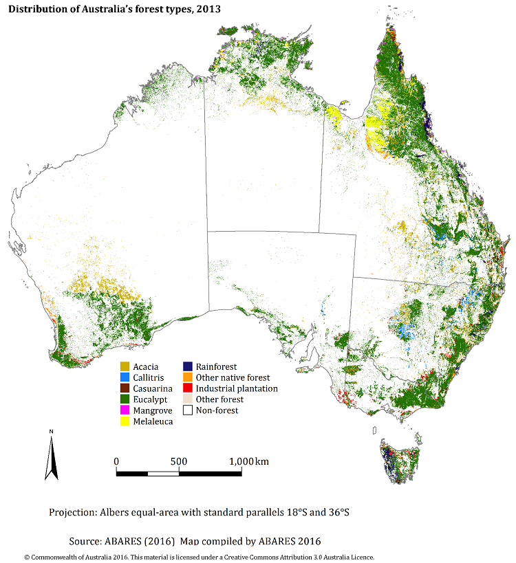
P – Pattern
Observe and identify the general patterns across the map by finding a high and low concentration of a particular feature.
For example: In the map below, most of Australia's forests are found along the eastern coast.
Q – Quantify
Extract specific and accurate information from the map as evidence of the patterns. Quantifying involves using statistics, amounts, sizes and locations to give specific details.
For example: Most of the forest types are eucalypts. Australian forests span from the northern tropical regions in Queensland to the temperate regions in the southeast including Tasmania.
E – Exceptions
Identify and quantify details that do not fit the patterns identified. Anomalies are also significant information for geographers.
For example: Forests can also be found on the south-western and southern parts of West Australia, including some inland regions.
Literacy in Practice Video: Geography - Photographs
Teacher: Gareth Evans
Unpacking photographs
Photographs frequently feature as a visual resource in the geography classroom. Students today are exposed to visual images every day, within and beyond the classroom, so it is important to help them develop a more critical eye to interpret photographs geographically (Halocha, 2008).
Photographs are often taken for specific purposes. Students need to consider how these purposes may affect their interpretation of the issue or aspect that the photographs are trying to portray. In addition, photographs provide a small and selective view. It is important therefore that students can understand the broader context in which the photograph is situated.
Geographers use several types of photographs, including ground-level photographs, oblique and vertical aerial photographs, and satellite images. Whereas vertical aerial photos and satellite images are more similar to maps (they are useful for portraying information about patterns across large areas of space), ground-level and oblique aerial photos require rather different interpretation skills.
Layers of inference
One strategy to help students interpret photographs critically is the layers of inference framework. This framework encourages students to first identify the literal meanings in photographs, then draw on their prior knowledge to build inferences and predictions.
The purposes of using the layers of inference framework are to encourage students to:
- examine photographs closely to identify specific features
- draw on their prior knowledge to make inferences or informed guesses or predictions
- become aware that the photographs present only partial evidence
- be curious and ask questions
- be critical by considering both what is shown and what is not shown (adapted from Roberts, 2013, p.155).
Teachers can support students to analyse photographs using the layers of inference framework using either a graphic organiser or as template below (Riley, 1999; Roberts, 2013). This strategy supports the Data and information sub-strand from Years 7 to 10 (VCGGC102,
VCGGC104,
VCGGC130,
VCGGC132).
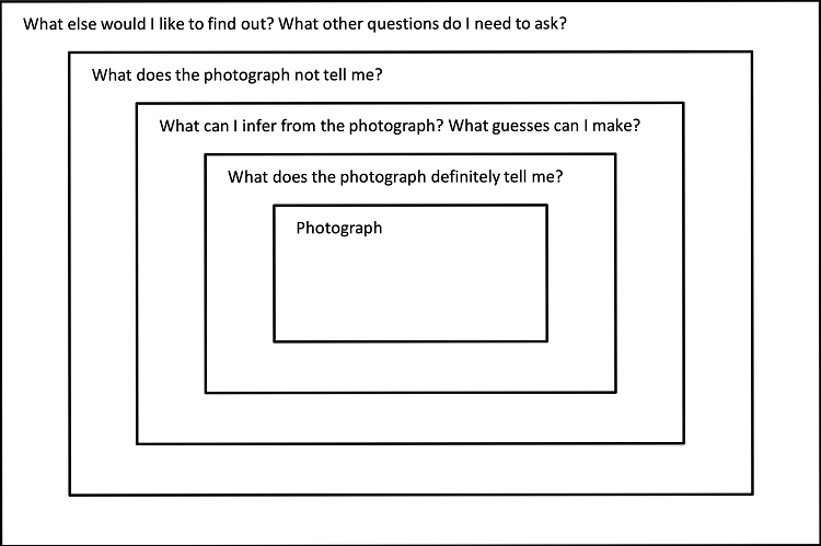
Layers of inference framework graphic organiser
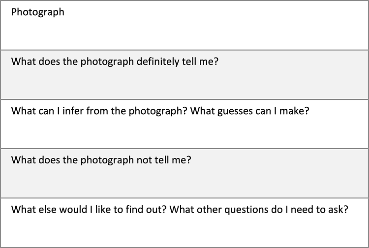
Layers of inference framework template
The following procedure for using the layers of inference framework involves three sequential steps (adapted from Roberts, 2013). These steps can be used by individual students, but the process is strengthened by peer collaboration. A Year 10 student work sample for Geographies of human wellbeing is provided (VCGGK153).
- Examine the photograph and any available contextual information for the photograph. This is often outlined in a caption.
- Answer the layers of inference questions starting with the inner questions and proceeding to the outer layers in turn. If possible, students work collaboratively to discuss and write their ideas and questions in the framework.
- Discuss responses to questions in turn and have students share their ideas and questions.