Creating and presenting statistical displays

Statistical displays (or charts) are a means of communicating large quantities of data in a visual way. Students need to consider carefully which type of statistical display is most appropriate for the data set to be illustrated and ensure that the key features of the display are clear and well-labelled for communicating clearly with others.

Understanding this strategy

In order to scaffold understanding of statistical displays (or any visual representation), teachers can pose questions to students that require them to:

  • read the data
  • read between the data
  • read beyond the data (Monteiro & Ainley, 2003).

These questions are embedded in the example below. Further, this strategy involves HITS 5: Collaborative Learning as it requires students to work together to critique different statistical displays.

Examples of this strategy in action

Example working together to critique statistical displays

Scenario

The teacher can either provide groups of students with a (large) data set, or ask them to access data from an appropriate online source (e.g. Bureau of Meteorology).

Categorising the data

You may choose to have groups working not just on different data sets, but also on different types of data: categorical, numerical (discrete and continuous) (definitions for these terms can be found in the Victorian Curriculum Mathematics Glossary).

The teacher asks students to identify what type of data their group has.

  • Is it categorical or numerical?
  • If numerical, is it discrete or continuous?

Working with the data in Excel

The teacher asks students to create several displays (charts) in Excel to illustrate their data set.

Students can find useful information about the different displays in Excel under Recommended Charts, e.g. "A line chart is used to display trends over time". See note below about histograms.

Students should include appropriate features (such as a heading, axis labels, scale/s and legend) on each display.

Classroom discussion

In preparation for the class discussion to follow, students should discuss:

  • which charts are more or less appropriate for their dataset

  • which charts reveal some interesting information about their dataset

Ask groups of students to present the displays that they created to the class, discussing the two issues above.

Fellow classmates and teachers can ask clarifying questions, or respectfully challenge the statistical displays the students are presenting.

Example using data to create statistical displays for discussion

The example below demonstrates how this strategy can be used in a Year 7 class on data representation and interpretation (VCMSP269).

Scenario

Consider an activity about rainfall at the Botanical Gardens. Ask students to visit the Bureau of Meteorology 'Information for students and teachers' website and download the data set on daily rainfall for the Melbourne Botanical Gardens for 2018 and 2019.

Students will need to download the chosen data sets onto their own device.

Teacher actions

Teacher asks students to identify the type of data their group has. Rainfall is a numerical and continuous variable. The teacher could ask students to focus on the rainfall in the given data sets.

Working with the data in Excel

Teacher asks students to use Excel to produce several charts to display their data. 

Encourage students to consider the type of display and what can be shown. 

Teacher asks the students to consider the features of each of the charts they have produced and decide which charts are appropriate for the given data. 

Two examples are shown below.

This histogram shows the number of days that received particular amounts of daily rainfall at the Royal Botanical Gardens
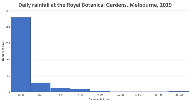
Histogram one shows the number of days that received particular amounts of daily rainfall at the Royal Botanical Gardens, Melbourne, in 2019.
This column graph shows how much rain fell at the Royal Botanical Gardens on each day of the year in 2019
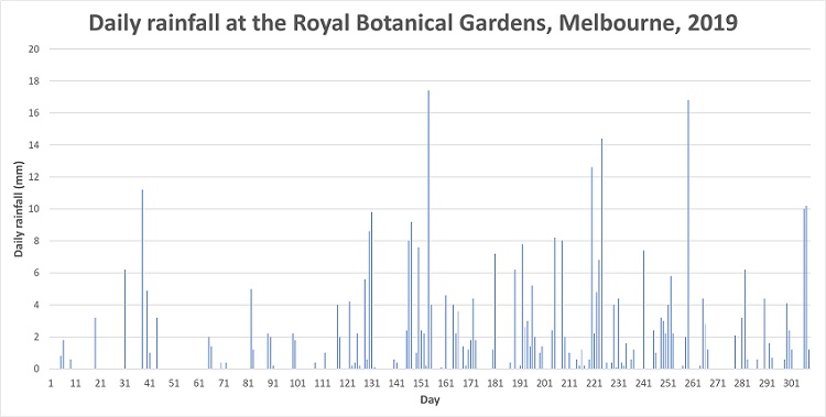
Histogram two how much rain fell at the Royal Botanical Gardens on each day of the year in 2019. The intervals along the horizontal axis is 10 days. 


Student Discussions 

Students might discuss the bin size for the histogram and how helpful it is having intervals of 10 for the column graph. 

Students might also discuss how the various charts help to represent the rainfall to enable them to make judgements about rainfall.

Discussion could centre about the information that is shown by a particular display and also what is not shown. For example, the first chart does not show rainfall over time, but does show that 0-2mm is the most frequent rainfall.

The teacher could ask various students to display their graphs using a data projector to prompt discussion of appropriateness of charts and interesting features of charts.

Ask students for any questions they have about given charts and any statements regarding what is shown by particular charts.

Additional notes on histograms

Creating histograms in Microsoft Excel

In the last few years, Excel has included a new option for creating histograms.

If students are unsure about width of intervals (i.e., 'bins') and use of the 'underflow' and 'overflow' bins you might want to recommend a recent online video (e.g. YouTube video: Creating Dynamic Histograms).

Terminology in Microsoft Excel

Note that Excel uses different terminology to that in the Victorian curriculum for histograms; the Victorian Curriculum Mathematics Glossary defines a histogram as "a statistical graph for displaying the frequency distribution of continuous data" while Excel (currently) allows histograms of categorical data.

Referring students to the video above (instead of Excel help) will ensure that they are using the same terminology for histograms as in the Victorian Curriculum.