A shared metalanguage of visual design enables students and teachers to understand and talk about how meaning can be made in still and moving image texts.
The visual design metalanguage provided here supports teaching viewing and creating visual meaning, and is informed by the work of Kress and van Leeuwen (2006), Callow (2023), and Painter, Martin and Unsworth (2013).
The visual metalanguage is organised around three simultaneously operating meaning functions, in the same way language is organised in the language strand in the Victorian curriculum. To effectively comprehend, respond to, and compose visual texts, students need to understand how visual semiotic (meaning making) resources enact meaning through three sub-strands:
-
Expressing and developing ideas in visual texts: for example, how meaning about who, what, where, when, why, can be designed through choices of lines, symbols, vectors, size, and colour.
-
Interacting and relating with others through visual texts: for example, how meaning about how we interact and relate with subjects and characters, and how we feel, can be designed through choices of focaliser or ‘who sees’, social distance, subject gaze, and colour.
- Composition and structure of the image: for example, how a visual text can be organised to create a cohesive, coherent whole, through choices of salience (what the viewer’s attention is drawn to first), colour, and viewing path.
- References
Analysing and creating visual advertisements
In this video, students analyse and create advertisements using metalanguage and their understanding about visual texts.
Expressing and developing ideas in images
Who, what, where, when, why?
Students learn how effective creators of visual texts use a range of visual semiotic (meaning making) choices including symbols, line, vectors, colour, and size to express actions and ideas, to represent the participants (the characters, or things/objects seen), the nature of the events (what is happening), and the circumstances (setting, context).
The following discussion questions can be used as a starting point for talking about any visual text. Following each question, ask students to expand on their responses by explaining reasons why, and encourage them to use evidence from the image to justify their responses. Teach/revise and continue to scaffold student use of visual design metalanguage through the discussion as appropriate.
- What type of text is this image from?
- What is this image about?
- Who and what is in this image? Who are the main participants – characters, or things/objects – seen?
- What is happening? What are different participants/objects doing?
- Where and when and why is this happening? What information is provided in the image which tells us about the circumstances surrounding these participants and actions?
Visual semiotic resources for expressing and developing ideas in images:
- Symbols
- Lines
- Vectors
- Size
- Colour
Symbols
Symbols or signs can be used to as short cuts to represent ideas or concepts. Symbolic aspects can include choice of casting, design of hair and make-up, choices of costume, props, and objects. It also includes icons. For example, the Eiffel Tower is a symbol often used to represent the city of Paris, heart symbols are used to represent love, and the colour red to symbolise danger, or perhaps romance, depending on the context.
Symbols can also be used to present concepts, and information in diagrams, graphs, timelines, and other forms of visual information texts.
Symbol examples and discussion prompts:
Example 1
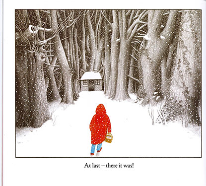
- What things do you see in this image which you recognise from somewhere else?
- Why has the author, Anthony Browne, chosen to use these symbols? What might this mean for what is happening this story?
For example, in this image, the small figure is wearing a red hooded cloak and carrying a basket, and there is small cottage in the woods. These items together symbolise the well-known story of Red Riding Hood. These symbols might be used here to signify to the reader that the character in the image is heading into danger.
From INTO THE FOREST by Anthony Browne
© 2004 Anthony Browne Reproduced by permission of Walker Books Australia Pty Ltd
Example 2
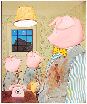
- Why has the author, Anthony Browne, chosen to use pigs as the characters here? What might this mean here?
- How are the pigs shown? What are they wearing? What do their dirty clothes tell us? For example, the casting of pigs as the main characters in this story provides symbolically important information, and so do the dirty clothes. Animals can be used to represent different things in different cultures and contexts. Pigs can be used to signify uncleanliness, and this is reinforced here by the state of their clothes.
- Who is outside the window? Why do you think the author included a wolf? What does a wolf usually symbolise in children's stories? How might this story change, if the main characters were represented as wolves instead of pigs?
From PIGGYBOOK by Anthony Browne
© 1986 Anthony Browne Reproduced by permission of Walker Books Australia Pty Ltd.
Lines
Choices about use of line in an image include: straight or curved, length, angle, intersection of vertical and horizontal lines, and direction. Lines are used in images to indicate movement and direction. Lines can be natural, formed by objects in the image, or artificial lines created by the author, using subject gaze, or pointing for example.
Discussion prompts: What sort of lines do you see in this image? Are these lines formed by natural objects in the image or created by the image maker? Where do the lines take your eye? What information does this use of straight/curved/intersecting lines give the audience about the circumstances of this situation? Why has the author chosen to use these lines like this? How would meaning change if these straight/curved/intersecting lines were replaced with a different type of line?
Lines example 1: Straight lines
Image source
Lines example 2: Curved lines
From Are We There Yet? by Alison Lester
Text and illustrations © Alison Lester, 2004
Published by Viking Reprinted by permission of Penguin Random House Australia Pty Ltd
Lines example 3: Intersecting lines
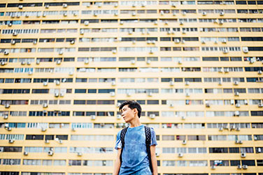
Image source
Vectors
A vector shows action and direction in an image through lines. A vector can be a visible line, for example use of lines in the three examples of lines above to indicate direction. A vector can indicate movement in a still image, for example using arrows in a diagram (Example 1).
Lines can also can indicate direction and movement in a still image. In Example 2, sets of lines indicate a dog is jumping and wagging its tail.
Vectors can also be created using the line of a shadow or an object, subject gaze or eye line, or a pointing arm or finger.
Discussion prompts: What sort of vectors do you see in this image? Are these vectors formed by natural objects in the image or created by the image maker? What information does this use of vectors give the audience about the circumstances surrounding these participants and actions?
Vectors example 1
Vectors example 2
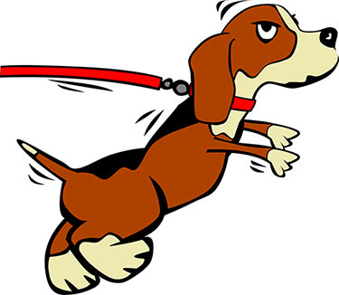
Image source
Size
Choices about size of objects in an image is a comparative process.
Discussion prompts: How big is something in the image in relation to something else? What information does this use of size give the audience about the circumstances of this situation? Why has the author chosen to use size like this? What might this mean? How would meaning in this image change if the size of the objects changed or were reversed?
Comparative size example 1

Image source
Comparative size example 2
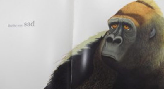
Colour
Colour can be used to express and develop ideas in images, for interacting and relating with others through images, and for composition and structure of images (Kress and van Leeuwen, 2002; van Leeuwen, 2010).
Use of colour can be symbolic and choice of colour in an image can be used to represent feelings and mood. The meaning viewers make depends on the context and is strongly influenced by historical and cultural conventions. For example, in Western societies white is usually thought to represent innocence, purity and cleanliness, and black is the colour of death and mourning; however, in China and parts of East Asia, white is the colour of death and mourning (Kress and van Leeuwen, 2002). Red is commonly used to represent different things. Depending on the context, red may represent danger such as in a stop sign, romance, or passion with red roses, and it symbolises good luck in China.
Colour has different properties. Three basic properties are the hue, brightness, and saturation.
Hue refers to basic colours we have names for such as yellow, blue, red, green, orange, purple, as shown in the examples below.
Colour examples

A yellow rose.
Image source.

A blue rose.
Image source.

A red rose.
Image source
Brightness refers to the illumination in the image, or how light or dark the colour is, ranging from fully illuminated to completely dark. See examples below of degrees of brightness demonstrated with a photograph of the same rose.
Illumination examples

High, mid and low illumination
CC (https://pixabay.com/en/rose-red-red-rose-flower-blossom-1974593/)
Saturation refers to how pure the colour. This can range from a vivid bright colour which is fully saturated (100%), to a desaturated colour which is less colourful, more washed out and dull. According to Painter (2008), fully saturated colours create ‘the visual equivalent of loudness in sound’ and generate ‘a mood of excitement and energy’ (p. 97). See examples of degrees of saturation below.
Colour saturation examples

High, then low level of colour saturation
Changing the hue, brightness or saturation of a colour can change the meaning of an image very quickly, as demonstrated in the comparative examples below. The brightly lit, deep red rose in the first image, can evoke feelings of pleasure and happiness, but if the same rose is shown as the gloomy, shadowed, dull dark rose in the second image, this can signify quite a different response from the viewer, perhaps fear or sadness.
Colour hue examples from bright to dull
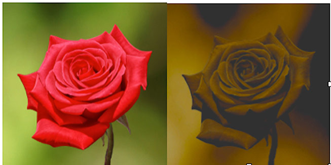
Bright then dull colour hue
Colour spectrum
Colour can also be ranged along a spectrum from warm colours to cool colours. Shades of red, orange, and yellow are considered to be warm colours, while cool colours are those using greens and blues and aqua (Painter, 2008, p. 99). This contrast is shown in the example colour wheel in Figure 5 below. The degree of colour saturation is also important. The redder the colour, the warmer it is perceived to be.
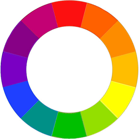
Colour wheel example showing the contrast between warm and cool colours.
This list identifies some of the widely shared meanings evoked by different colours, informed by various sources including Chapman (2010), Kress and van Leeuwen (2002), Painter (2008), van Leeuwen (2010), and Zammitto (2005).
-
Black: evil, menacing, rebellion, strength, mystery, secrets, depression, grief, night. Black is the colour of death and mourning in almost all western countries. Black is also used to denote sophistication, power, formality, authority, and style.
-
White: light, purity, innocence, cleanliness, cold, ice, snow, sterility, new. Western brides wear white to symbolise chastity.
-
Blue: peace, tranquillity, truth, dignity, power, melancholy, cold, sadness, honour, calmness, faithfulness, holiness, loyalty, wisdom, seclusion, loneliness, thinking, distance.
-
Red: love, rage, fire, anger, heat, passion, warmth, urgency, blood, excitement, power, danger, warfare, hostility, appetite, health, courage, majesty, aggression. Red is often used as an accent colour to make things stand out.
-
Yellow: happiness, sunshine, joy, cheerfulness, energy, warmth, hope, intelligence, logical thinking, innovation, spirituality, life. Dull yellow can signify cowardice, ruin, shame, illness, decadence (Zammitto, 2005).
-
Green: nature, growth, fertility, durability, environment, freshness, relaxation, health, energy, new life, tranquillity, vegetation, money, and jealousy
-
Purple: wealth, royalty, religion, holiness, power, grandeur, sophistication, intelligence.
-
Brown: stability, natural, nature, wood, earth, soil, ground, earthy, reliable.
-
Orange: warmth, strength, autumn, cheerful, stimulating, change, vitality, creativity.
-
Grey: dull, plain, unassuming, neutrality, coolness.
Colour examples for discussion: Example 1
In this image, we notice the figure in the red coat; the use of red as the accent colour draws the eye to this point first. The white snow and grey trees could evoke feelings of cold and loneliness.
Discussion prompts:
- What colours do you see in this image
- What colour do you notice first?
- How does this make you feel?
- In what ways do these choices of colour add to the story telling?
- Why has the author, Anthony Browne, chosen to use these colours?
- How would different choices of colours change the feelings this picture evokes?
From INTO THE FOREST by Anthony Browne
© 2004 Anthony Browne Reproduced by permission of Walker Books Australia Pty Ltd
Colour examples for discussion: Example 2
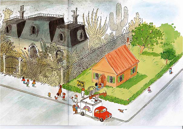
This image is from the front of the book, Rose meets Mr Wintergarten. Bob Graham uses colour in different ways in different parts of the picture. Rose and her family are shown using lots of bright warm, friendly colours, while Mr Wintergarten’s house is dark, gloomy, black, grey, and cold.
Discussion prompts:
- What colours do you see in this image?
- What do you notice about the use of colour?
- How does the use of colour change across the two parts of this image?
- How does the dark side of the image make you feel?
- Who do you think might live in this house?
- What sort of person might this be?
- What makes you think that?
- What about the colourful side?
- Who do you think might live in this house?
- What might these people be like? Why?
- How does the use of colour influence our responses?
- What do you think the author/ illustrator, Bob Graham, wants us to think about the two houses at the beginning of the book?
- In what ways do these contrasting choices of colour add to the story telling?
- How would different choices of colours change these responses?
From ROSE MEETS MR WINTERGARTEN by Bob Graham
© 1992 Blackbird Design Pty Ltd Reproduced by permission of Walker Books Australia Pty Ltd
Interacting and relating with others through the image
How do we interact and relate? How do we feel?
Students learn that authors of images make visual design choices to build relationships and interactions between the participants in the text. These text participants are: the author, the audience, and the subject/s (characters in a literary text, or the main things/objects in a factual text).
The author also makes visual design choices to express knowledge, skills, trustworthiness, power and status, attitudes, feelings, and opinions. For example, the author makes visual design choices which can establish a particular attitude or point of view about the topic or subject and tries to align the audience with this position.
For each question, ask students to expand on their responses by explaining reasons why, and encourage them to use evidence from the image to justify their responses. Teach/revise and continue to scaffold student use of visual design metalanguage as appropriate.
- As the viewer, how are you positioned to see and interact with the subject/s in this image?
Who are you positioned to see this image as? (focaliser)
How close or far away is the subject to you? (social distance)
Is the subject looking directly at you or away from you? (gaze)
How is colour used to represent feelings and mood, and to influence your response? (see colour in Expressing and developing ideas in images above)
Is the subject turned towards or away from you?
Does the subject appear to have the same level of power as you, or more power, or less power, in this interaction? - How do these design choices affect how you feel about the subject/s and what is happening in this image? (How might alternative options change your response?)
Visual semiotic resources for interacting and relating to others through images:
- Focaliser
- Social distance
- Subject Gaze
Focaliser
Focalisation, the design of visual point of view, is how the author positions the viewer to see the subjects and action in an image. The author can use different choices of focaliser, or ‘who sees’, to create and manipulate the external viewer's position and affiliation with characters or the subject of the image. In sequential narrative texts such as film or animation, or picture books, ‘the author can manipulate the external viewer's position and affiliation with characters as the story unfolds, adding colour, richness, and emotional layers to storytelling’ (O’Brien, 2014, p. 124).
The focaliser options for designing how the audience sees events are:
- Direct as viewer/reader [yourself];
- Indirectly, mediated through a character – either as character [first-person], or along with character, for example looking over a character's shoulder (Painter, Martin, Unsworth, 2013).
The following general discussion prompts are intended to develop student knowledge of these options for choice of focaliser in an image or visual text, and the possible impact this might have the viewer. Students are encouraged to examine the choice of focaliser in each image, and to consider how this affects viewer alignment with characters.
Discussion prompts: Are you positioned to see this image directly – as yourself? Alternatively, do you see what is happening indirectly, via a character? How do you know? What evidence is there in the image to support this?
How does this choice of focaliser affect how you feel about these characters, or this subject, and what is happening to them? Do you feel more closely aligned to one character? Why do you think the author made this choice of focaliser for this image? If you changed the focaliser, for example from direct 'as viewer', to 'as character', or vice versa, how do you think this might change your feelings about, or response to, what is happening in this image?
Direct as viewer
‘Direct as viewer’ is the most common choice of focaliser (O’Brien, 2014). The viewer is positioned as an outsider looking in at the events and actions within the image. Everything is laid out for you to see.
‘Direct as viewer’ example.
From Scary Night by Lesley Gibbes and Stephen Michael King
Copyright © 2014, Adelaide SA: Working Title Press
Indirectly - As character
Focalising ‘as character’ shows what the character can see, as if through a character's eyes. This is designed to align the viewer more closely with the focalising character. Focalising as a character means that your view point is restricted to see only what this character can see.
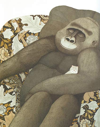
Focalising ‘as character’ can be inscribed through use of the focalising character’s shadow as in the example from Piggy Book by Anthony Browne below. Here, the reader understands that we are positioned to see this scene through the eyes of the mother. This meaning is inscribed by the mother's shadow which indicates she is standing exactly where we, as the viewer, are positioned. In this image, the shadow also creates a strong vector leading the eye into the image.
Other options for an inscribed 'as character' focaliser, include showing a body part from the focalising character, for example, a hand on a door handle, or stretching out in the foreground of the image.
‘As character’ example.
From PIGGY BOOK by Anthony Browne
© 1986 Anthony Browne Reproduced by permission of Walker Books Australia Pty Ltd
Focalising through the eyes of a character can also be inferred across a sequence of two images. For example, in the double page spread from Piggy Book below, the subjects are introduced in the first image. We see the mother facing towards us, and the father pig and the two sons have their backs to us, facing her. In the following image we are now positioned to look directly at the pigs who remain kneeling on the ground. Based on what we saw previously, we can infer that we are now positioned as the mother and what we see is now mediated through her eyes. This technique strongly aligns the viewer with the mother in this example.
In film, this is called a shot, reverse-shot.
Shot -reverse-shot example.
From PIGGY BOOK by Anthony Browne
© 1986 Anthony Browne Reproduced by permission of Walker Books Australia Pty Ltd
Indirectly - Along with character
The Along with character option positions the viewer to see events indirectly, almost as if from a character’s perspective, but not quite. An over-shoulder view positions us close in behind or beside a character. While part of the character’s body is seen from behind, this perspective also shows what the character sees. In the example below, from The Tunnel by Anthony Browne, the over-shoulder view aligns the viewer closely with the boy as his sister gazes at him, and, therefore, also at us. By positioning the viewer along with the boy, we are drawn into this significant interaction between the two characters in a way which highlights the closeness of the boy and his sister in this pivotal scene. The design of this image emphasises the emotional connection between the characters for the reader.
‘Along with character’ example.
From THE TUNNEL by Anthony Browne
© 1989 Anthony Browne Reproduced by permission of Walker Books Australia Pty Ltd
Social distance
Social distance is the distance between the viewer/focaliser and subject. How close or far away is the subject shown? Social distance is measured on a continuum from extremely close, to extremely remote. This is based on how comfortable we generally feel with people being close to us, in real life situations.
The following general discussion prompts are intended to develop student knowledge of these options for choice of social distance in an image or visual text, and the possible impact this might have the viewer, and the type of interaction created between the viewer and the subject.
Students are encouraged to examine the choice of social distance between the viewer and the subject in each image, and to consider how each design choice affects viewer connection to, and alignment with characters.
Discussion prompts:
- How are you positioned to see this image?
- Is the subject close or far away?
- How does this choice of social distance affect how you feel about these characters or this subject, and what is happening?
- Why do you think the author made this choice of social distance here?
- If you changed the social distance in this image, for example from close to public, or remote, or vice versa, how do you think this might change your feelings about, or response to, what is happening in this image?
Close social distance
If the subject is shown to be very close to you, it takes up most of the frame, and you can only see part of the subject. As seen in the example from Little Beauty by Anthony Browne below, a close framing of the subject is created through a close-up. A close-up can imply a close, intimate, and familiar relationship with the subject. This can be comfortable if you like the character but might be confronting if the character is a bully for example.
Close social distance example.
From LITTLE BEAUTY by Anthony Browne
© 2008 Brun Limited Reproduced by permission of Walker Books Australia Pty Ltd
Mid social distance
This is where the subject is quite close, as seen in the second image from Little Beauty below. It shows at least half of the subject’s body in the frame, and a little bit of the setting. This is considered a friendly distance as in real life we would be close enough to touch each other and talk. This framing of the subject is created through a mid-shot.
Mid social distance example.
From LITTLE BEAUTY by Anthony Browne
© 2008 Brun Limited Reproduced by permission of Walker Books Australia Pty Ltd
Group social distance
When you can see the character’s whole body, and perhaps other characters, and more of the setting, this indicates that the subject is further away from you. This is group social distance where you are positioned to be part of a larger group. As evident in the image below from The Tunnel by Anthony Browne, we are positioned close enough to feel involved with these boys and their ball game, but it is less personal. This framing of the subject is created through a mid-long shot.
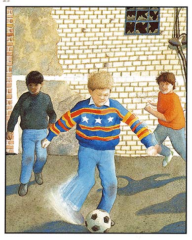
Group social distance example.
From THE TUNNEL by Anthony Browne
© 1989 Anthony Brown Reproduced by permission of Walker Books Australia Pty Ltd
Public social distance
The further a subject is positioned away from you, the less connection you feel, and subjects therefore appear like strangers. We are too far away to easily talk to the subject. In the example below from Rose meets Mr Wintergarten by Bob Graham, Mr Wintergarten is small and distant, and Rose and her family are even further away outside the window. As the subjects become further away, and therefore smaller, the setting becomes more dominant. The framing of the subject at this distance is created through a long shot.
Public social distance example.
From ROSE MEETS MR WINTERGARTEN by Bob Graham
© 1992 Blackbird Design Pty Ltd Reproduced by permission of Walker Books Australia Pty Ltd
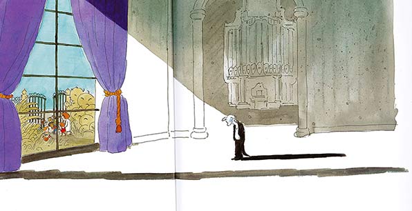
Remote social distance
When the subject is positioned a very long way away from you, the subjects are tiny and hard to recognise in the vast setting. This remote social distance means there is no opportunity for social interaction. This remote framing of the subject is created through an extreme long shot. This is shown in the example below from Rose meets Mr Wintergarten by Bob Graham. This image from the front of the book, shows the setting in detail, but the subjects are tiny and a very long way from the viewer. There is no social connection possible.
Remote social distance example.
From ROSE MEETS MR WINTERGARTEN by Bob Graham
© 1992 Blackbird Design Pty Ltd Reproduced by permission of Walker Books Australia Pty Ltd
Subject gaze
There are only two options for subject gaze: direct gaze, or no-gaze (Kress and van Leeuwen, 2006).
The following general discussion prompts are intended to develop student knowledge of these options for choice of gaze from a subject in a visual text, and the possible impact this might have the viewer.
Students are encouraged to examine the use, or not, of direct subject gaze in each image, and to consider the impact of this on the nature of the interaction between the character and the viewer, and how this affects viewer alignment with, and connection to, characters.
Discussion prompts:
- Is the subject looking directly at you?
- How does use of subject gaze, or no gaze, affect how you feel about this subject and what is happening?
- Why do you think the author made this choice?
- If you changed this image so the subject now gazes directly at you, or the subject now looks away ignoring you, how might this change your feelings about, or response to, this subject and what is happening?
Direct Gaze
When the subject gazes directly at the viewer, this simulates eye contact and positions the viewer as a participant in the interaction. Direct subject gaze, such as seen in the Piggy Book example below, where the three pigs are looking directly at the viewer, demands the viewer’s attention and for us to share the experience. Subject gaze creates a connection between the subject and the viewer, simulating a powerful personal connection. This has even more impact on the viewer if combined with a close social distance such as in this example.
In this example, the direct gaze is mediated to the viewer through the mother, as we are seeing this through her eyes on this page of the book, as discussed above. This strengthens the alignment of the viewer to the mother's perspective in this story.
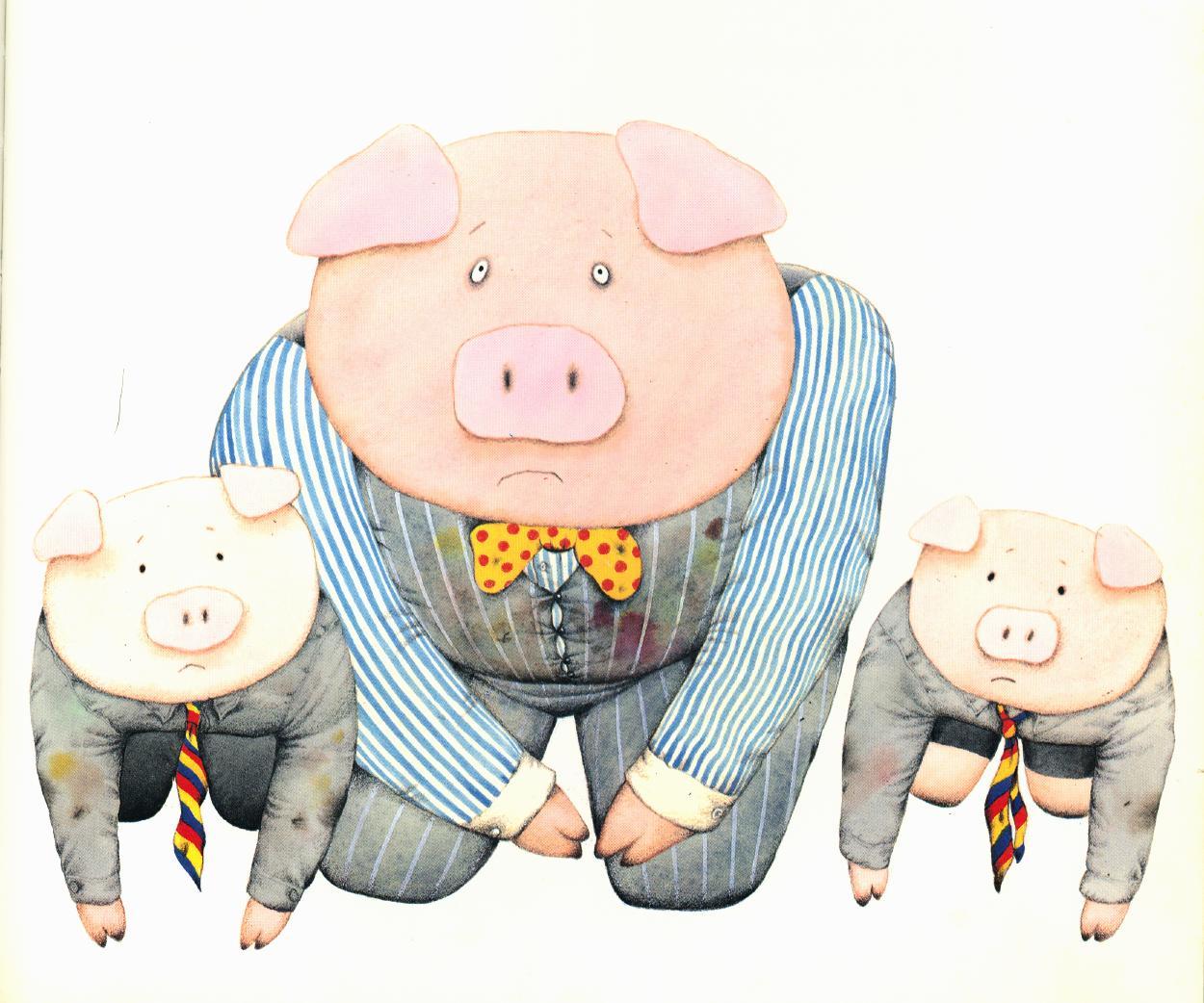
Direct gaze example.
From PIGGY BOOK by Anthony Browne
© 1986 Anthony Browne. Reproduced by permission of Walker Books Australia Pty Ltd
No gaze
This is the most common type of image. As seen in the image from Little Beauty by Anthony Browne, below, the subject’s eyes are turned away from the viewer. This positions us as an observer to what is happening. The subject does not acknowledge the viewer and we are kept outside the story world.
No gaze example.
From LITTLE BEAUTY by Anthony Browne
© 2008 Brun Limited
Reproduced by permission of Walker Books Australia Pty Ltd
Composition and structure of the image
How is the image organised to create a cohesive, coherent whole?
Students learn how texts are structured to achieve particular purposes, and that visual design choices are used to create texts that are logical, cohesive, and coherent with varying levels of complexity. Students learn how the image maker guides the viewer through the text through the deliberate choices of visual design at the level of the whole text, and components within the text. In examining how the image or text is organised, students learn how visual design choices can prioritise some meanings and background others (Painter, Martin & Unsworth, 2013).
For each discussion question, ask students to expand on their responses by explaining reasons why, and encourage them to use evidence from the image to justify their responses. Teach/revise and continue to scaffold student use of visual design metalanguage as appropriate.
- How is the image flow of information in the image organised?
- What do you notice first? How has the author drawn your attention to this part of the image? (Salience)
- How is your eye drawn from one point to another across the image? (Reading path)
- How is colour used to organise information, and to influence the layout of this image? (see colour in Expressing and developing ideas in images above)
- If you imagine the image to be divided equally into four quadrants, where is the main subject/s and the action placed in the text? For example, is this in the top or bottom of the image? On the left or right side? Or in the middle?
- Is there a frame around the image? How thick is the frame border? Is there a lot of white space on the page around the edges? Or is the image spread across two pages?
- How do these elements draw the image together as a cohesive whole?
- If you changed any of these aspects, how would that affect the meaning of this image?
Salience
Salience is how the viewer's eye is drawn to what is important in the image. An aspect of an image can be highlighted by placement in the foreground, size of the object, and contrast in tone or colour. (Also see colour above.)
For example, what do you notice first in the image below from Into The Forest, by Anthony Browne? Here, the red hooded cloak draws our eye. The line of the trees leading towards the cottage with its open door then leads the eye along a reading path.
Salience example.
From INTO THE FOREST by Anthony Browne
© 2004 Anthony Browne
Reproduced by permission of Walker Books Australia Pty Ltd
Viewing/reading path
Reading paths are how the eye is drawn to something in the image first, and then vectors lead the viewer from this object through the image from point to point. Vectors can be visible, using lines and arrows as shown in the Vectors section. Vectors can also be invisible, for example the direction in which a participant is looking, as this leads the viewer's eye towards what is being looked at.
Usually, the English-speaking reader will read a page from left to right and from top to bottom. However, image authors can design specific reading paths which can begin and end in different ways.
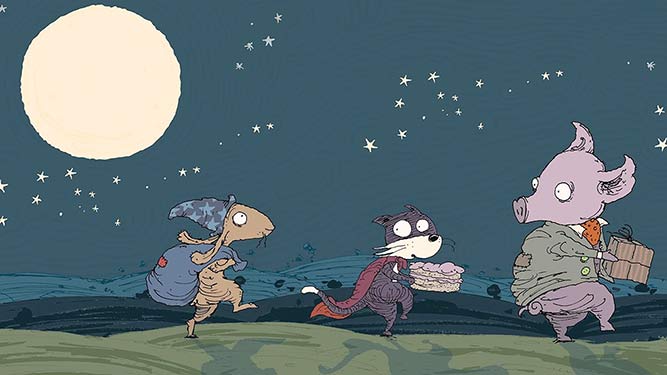
Identify the vectors in the image below from Scary Night by Lesley Gibbes and Stephen Michael King. Where are these vectors directing your gaze? Do these vectors direct your gaze towards a particular viewing/reading path in the image?
Along a horizontal line we can be directed to view from left to right, or from right to left. For example, in the example, our eye is perhaps first drawn to the large moon, in the top left-hand quadrant, and is then lead down to the first character on the left.
This character points the viewer to read to the right across the image. However, at the end of this horizontal vector, the largest and final character on the right is facing back to the left. This points the viewer back to the left again, focusing our attention on the smallest character in the middle. Each of the characters on the left, and the right of this character, are directing us to this point.
Viewing/reading path example.
From SCARY NIGHT by Lesley Gibbes and Stephen Michael King
Copyright © 2014, Adelaide SA: Working Title Press
The vector lines in the Piggy Book image below, marked in red, show how this image has a more complex reading path. The reader's eye is probably first drawn to the most salient item, the large pink expanse of the father pig's head. The reading path then follows the father pig's gaze down to the small pig's eyes. The father pig’s ears are also pointing us in this direction. The reading path then follows the son's gaze back up to the father's eyes, emphasised by the small pig's ears also pointing us back in this direction. The reading path then follows the line of the father's snout pointing across to the left, to draw the viewer's attention to the window and to the wolf.
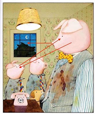
Vectors example
From PIGGY BOOK by Anthony Browne
© 1986 Anthony Browne
Reproduced by permission of Walker Books Australia Pty Ltd
References
Chapman, C. (2010) Color theory for designers,
Part 1: the meaning of colour. Smashing Magazine.
Callow, J. (2023). The Shape of Text to Come: How Image and Text Work(2nd ed.). Primary English Teaching Association (Australia) (PETAA).
Kress, G. & van Leeuwen. T. (2002). Colour as a semiotic mode: notes for a grammar of colour. Visual Communication,1 (3), 343-368.
Kress, G., & van Leeuwen, T. (2006). Reading images: the grammar of visual design (2nd ed.). London: Routledge.
O'Brien, A. (2014). Using focalisation choices to manipulate audience viewpoint in 3-D animation narratives: what do student authors need to know? In L. Unsworth & A. Thomas (Eds.), English Teaching and New Literacies Pedagogy: Interpreting and authoring digital multimedia in the classroom: Peter Lang
Painter, C. (2008). The role of colour in children’s picture books: Choices in AMBIENCE. In L. Unsworth (Ed.), New Literacies and the English Curriculum (pp. 89-111). London; New York: Continuum
Painter, C., Martin, J. R., & Unsworth, L. (2013). Reading Visual Narratives: image analysis of children's picture books: Equinox Publishing Limited.
van Leeuwen, T. (2010). Languages of Colour London: Routledge.
Zammitto, V. L. (2005).
The expressions of colours. In Conference proceedings of DiGRA’05, changing views: Worlds in Play, Digital Games Research Association.